Brand Assets
Guidelines and assets for representing VERZA TV in press, on partner surfaces, and across creator content. Following these keeps the brand consistent and instantly recognizable. For packaged downloads and additional resources, see the media kit.
Logo & Marks
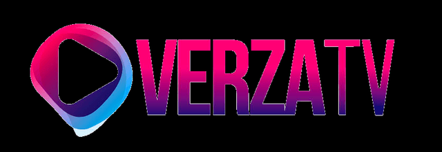
Primary logo
The VERZA TV wordmark on dark backgrounds. Maintain clear space equal to the cap height of the wordmark on all sides; never crowd it.
Logo on light
A high-contrast variant for light backgrounds and print. Use only the approved variant — do not recolor the wordmark.
App icon
The standalone mark for app stores, favicons, and avatars. Keep it on the brand accent or background; do not place it on busy imagery.
Social avatar
Square, centered mark sized for social profiles. Maintain padding so the mark is not cropped by circular masks.
Color Palette
Primary brand accent, calls to action, links
App and page background, deepest layer
Cards, panels, and raised content
Elevated surfaces and hover states
Primary text on dark surfaces
Body and secondary copy
Premium highlights and VIP accents
Coins, pricing, and monetization cues
Live indicators and urgent states
Confirmations and positive states
Typography
Display & headings
Bold, high-contrast sans-serif
Headlines run heavy and tight for an editorial, premium feel. Reserve the largest weights for page titles and hero statements.
Body
Clean, legible sans-serif
Set body copy at relaxed line-height for comfortable mobile reading. Favor short paragraphs and clear hierarchy.
Labels & eyebrows
Uppercase, letter-spaced
Section labels use uppercase with wide tracking in the brand accent to anchor structure without competing with headings.
Voice & Tone
Cinematic, not casual
We write like a studio, not a feed. Confident, vivid, and editorial — every line earns its place the way every second of an episode does.
Bold but precise
We make strong claims and back them with specifics. No filler, no hype for its own sake. The drama is in the story, not the adjectives.
Audience-first
We respect attention. Copy is tight, scannable, and rewarding — the same standard we hold for the viewing experience itself.
Usage Don'ts
- Do not stretch, skew, or rotate the logo.
- Do not recolor the wordmark outside the approved palette.
- Do not add drop shadows, gradients, or outlines to the mark.
- Do not place the logo on low-contrast or busy backgrounds.
- Do not recreate or substitute the wordmark with another typeface.
Need an asset that isn't here?
press@verzatv.com